Redesigning a B2B SaaS dashboard that had outgrown its early-MVP layout — giving users a clear, scannable view of the metrics that actually drive their decisions.
PayGaps' dashboard was built fast, early, and generically — the layout it shipped with wasn't designed around what B2B users actually needed to see first. As the product matured, the gap between "what's on screen" and "what the user came here for" kept widening.
I led the redesign end-to-end: stakeholder and user research, information architecture, a rebuilt component system, and high-fidelity UI — ready for engineering handoff.
The existing dashboard treated every metric with equal visual weight — a common symptom of MVP-stage design decisions that never got revisited as the product and its users matured.
Users had to hunt for the numbers that actually drove their decisions, buried among lower-priority data with no clear hierarchy or path to action.
This project was a good test case for folding AI tooling into a real B2B redesign — using it to compress the slow parts of the process so more time went into the decisions that actually needed a designer's judgment.
AI tooling shaped the speed of exploration, not the final call. Which metrics earned top-of-fold placement, how dense the tables could get before they hurt scannability, and the actual visual hierarchy were all decisions made through direct stakeholder feedback, not generated output.
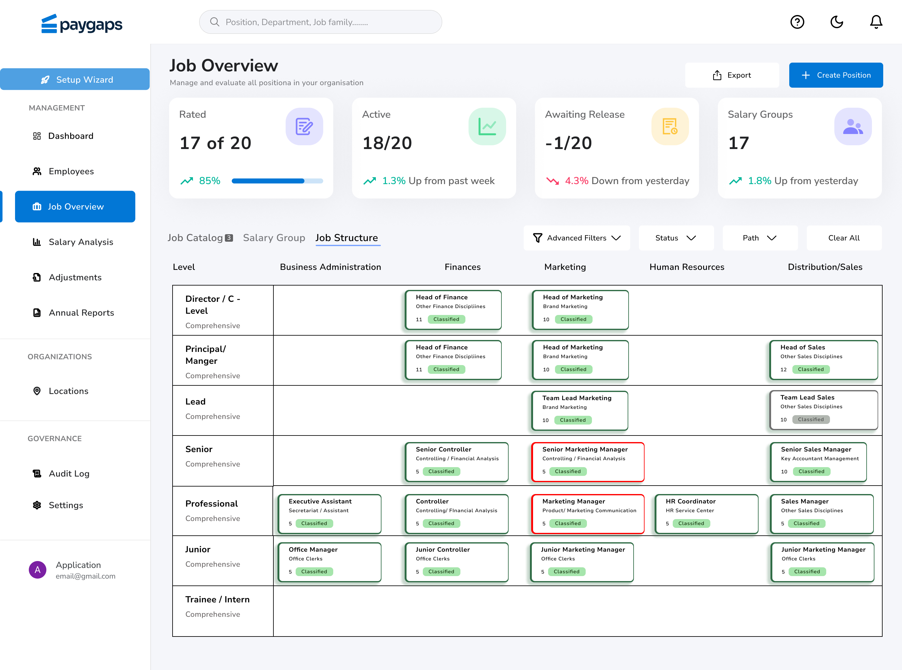
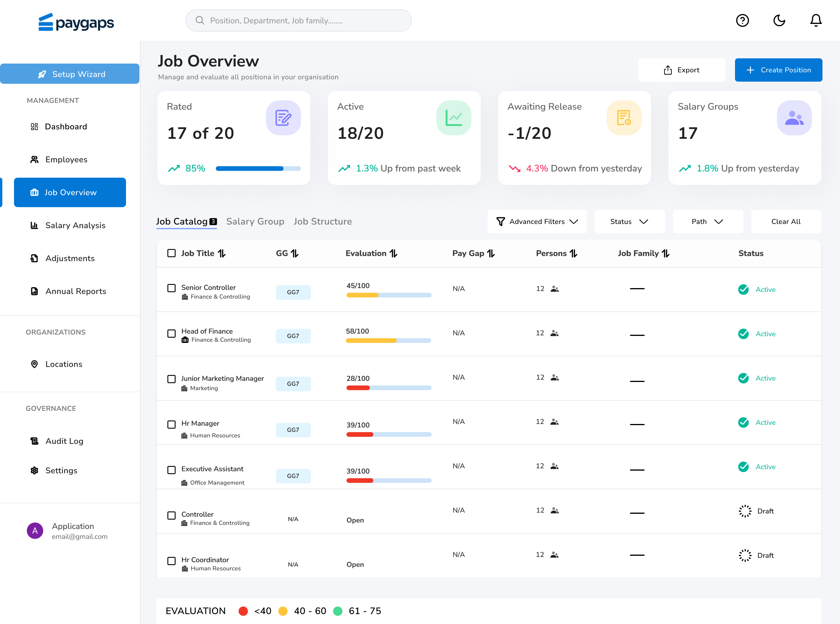
The rebuilt dashboard gives two complementary views: a Job Structure grid mapping every role across department and seniority level, and a Job Catalog list showing evaluation scores, pay-gap status, and headcount per role — so users can move between "where does this role sit" and "how is it actually performing" without losing context.
AI tools are genuinely useful for compressing the parts of a redesign that don't need a designer's judgment — synthesis, early exploration, first-draft copy. The parts that do — what actually matters to the user, and why — still come from talking to them directly.